5 Lesson 2a: Simple linear regression
Linear regression, a staple of classical statistical modeling, is one of the simplest algorithms for doing supervised learning. Though it may seem somewhat dull compared to some of the more modern statistical learning approaches described in later modules, linear regression is still a useful and widely applied statistical learning method. Moreover, it serves as a good starting point for more advanced approaches because many of the more sophisticated statistical learning approaches can be seen as generalizations to or extensions of ordinary linear regression. Consequently, it is important to have a good understanding of linear regression before studying more complex learning methods.
This lesson introduces simple linear regression with an emphasis on prediction, rather than explanation.
-
Modeling for explanation: When you want to explicitly describe and quantify the relationship between the outcome variable \(y\) and a set of explanatory variables \(x\), determine the significance of any relationships, have measures summarizing these relationships, and possibly identify any causal relationships between the variables.
-
Modeling for prediction: When you want to predict an outcome variable \(y\) based on the information contained in a set of predictor variables \(x\). Unlike modeling for explanation, however, you don’t care so much about understanding how all the variables relate and interact with one another, but rather only whether you can make good predictions about \(y\) using the information in \(x\).
Check out Lipovetsky (2020) for a great introduction to linear regression for explanation.
5.1 Learning objectives
By the end of this lesson you will know how to:
- Fit a simple linear regression model.
- Interpret results of a simple linear regression model.
- Assess the performance of a simple linear regression model.
5.2 Prerequisites
This lesson leverages the following packages:
# Data wrangling & visualization packages
library(tidyverse)

# Modeling packages
library(tidymodels)
We’ll also continue working with the ames data set:
Take a minute to check out the Ames data from
AmesHousing::make_ames(). It is very similar to the Ames
data provided in the CSV. Note that the various quality/condition
variables (i.e. Overall_Qual) are already encoded as
ordinal factors.
5.3 Correlation
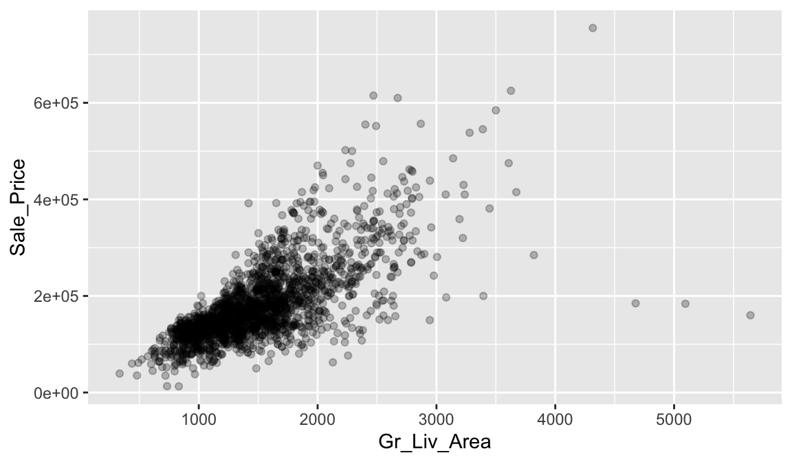
Correlation is a single-number statistic that measures the extent that two variables are related (“co-related”) to one another. For example, say we want to understand the relationship between the total above ground living space of a home (Gr_Liv_Area) and the home’s sale price (Sale_Price).
Looking at the following scatter plot we can see that some relationship does exist. It appears that as Gr_Liv_Area increases the Sale_Price of a home increases as well.
Correlation allows us to quantify this relationship. We can compute the correlation with the following:
ames_train %>%
summarize(correlation = cor(Gr_Liv_Area, Sale_Price))
## # A tibble: 1 × 1
## correlation
## <dbl>
## 1 0.708The value of the correlation coefficient varies between +1 and -1. In our example, the correlation coefficient is 0.71. When the value of the correlation coefficient lies around ±1, then it is said to be a perfect degree of association between the two variables (near +1 implies a strong positive association and near -1 implies a strong negative association). As the correlation coefficient nears 0, the relationship between the two variables weakens with a near 0 value implying no association between the two variables.
So, in our case we could say we have a moderate positive correlation between Gr_Liv_Area and Sale_Price. Let’s look at another relationship. In the following we look at the relationship between the unfinished basement square footage of homes (Bsmt_Unf_SF) and the Sale_Price.
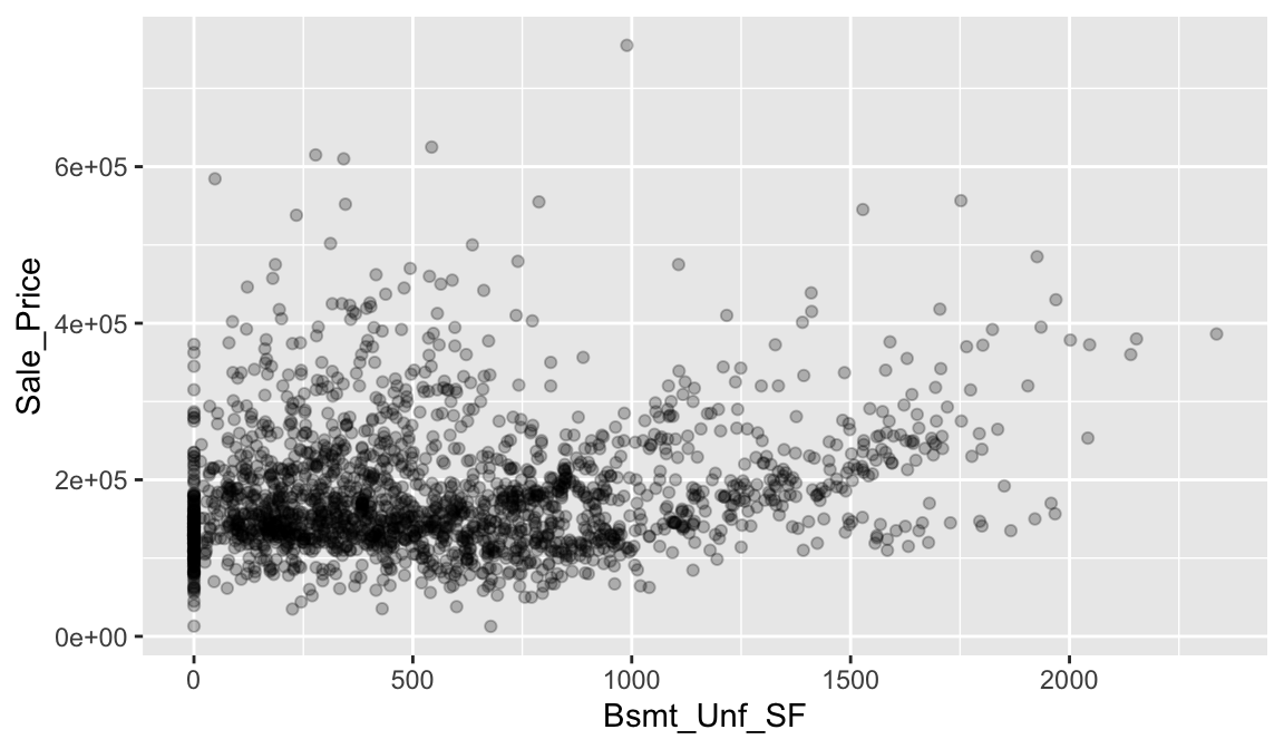
In this example, we don’t see much of a relationship. Basically, as Bsmt_Unf_SF gets larger or smaller, we really don’t see a strong pattern with Sale_Price.
If we look at the correlation for this relationship, we see that the correlation coefficient is much closer to zero than to 1. This confirms our visual assessment that there does not seem to be much of a relationship between these two variables.
ames_train %>%
summarize(correlation = cor(Bsmt_Unf_SF, Sale_Price))
## # A tibble: 1 × 1
## correlation
## <dbl>
## 1 0.1865.3.1 Knowledge check
- Interpreting coefficients that are not close to the extreme values of -1, 0, and 1 can be somewhat subjective. To help develop your sense of correlation coefficients, we suggest you play the 80s-style video game called, “Guess the Correlation”, at http://guessthecorrelation.com/
-
Using the
ames_traindata, visualize the relationship betweenYear_BuiltandSale_Price. - Guess what the correlation is between these two variables?
- Now compute the correlation between these two variables.
Although a useful measure, correlation can be hard to imagine exactly what the association is between two variables based on this single statistic. Moreover, its important to realize that correlation assumes a linear relationship between two variables.
For example, let’s check out the anscombe data, which is a built-in data set provided in R. If we look at each x and y relationship visually, we can see significant differences:
p1 <- qplot(x = x1, y = y1, data = anscombe)
p2 <- qplot(x = x2, y = y2, data = anscombe)
p3 <- qplot(x = x3, y = y3, data = anscombe)
p4 <- qplot(x = x4, y = y4, data = anscombe)
gridExtra::grid.arrange(p1, p2, p3, p4, ncol = 2)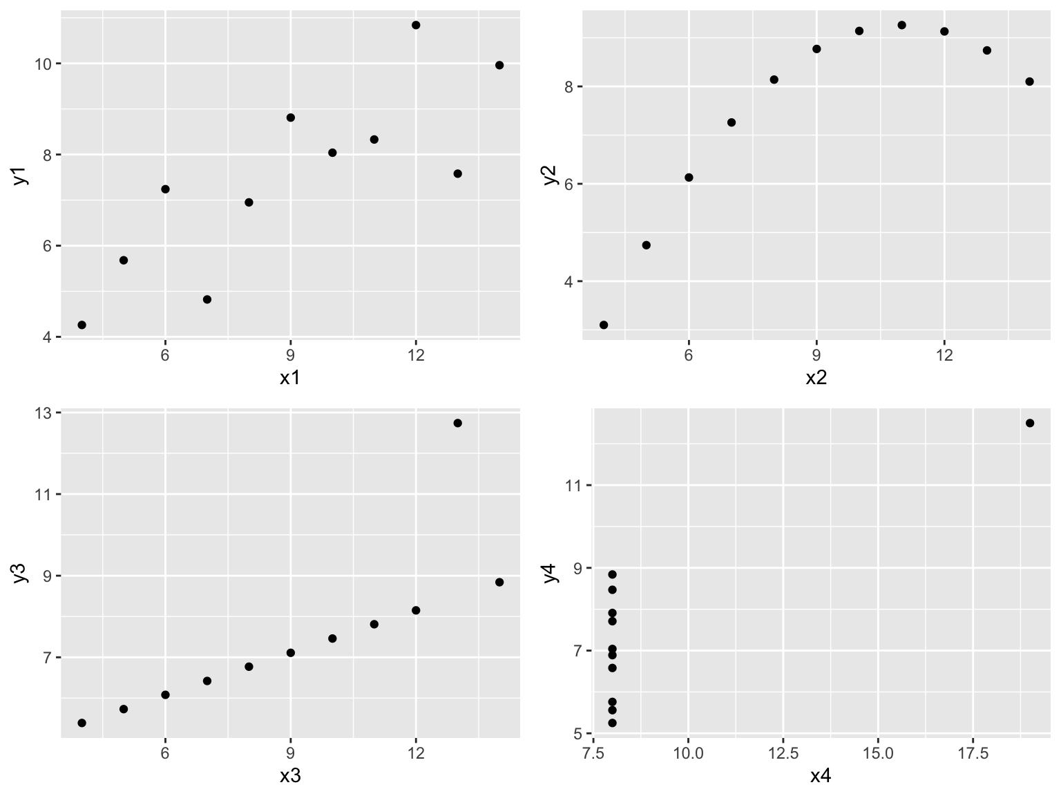
However, if we compute the correlation between each of these relationships we see that they all have nearly equal correlation coefficients!
Never take a correlation coefficient at face value! You should always compare the visual relationship with the computed correlation value.
anscombe %>%
summarize(
corr_x1_y1 = cor(x1, y1),
corr_x2_y2 = cor(x2, y2),
corr_x3_y3 = cor(x3, y3),
corr_x4_y4 = cor(x4, y4)
)
## corr_x1_y1 corr_x2_y2 corr_x3_y3 corr_x4_y4
## 1 0.8164205 0.8162365 0.8162867 0.8165214There are actually several different ways to measure correlation. The most common, and the one we’ve been using here, is Pearson’s correlation. Alternative methods allow us to loosen some assumptions such as assuming a linear relationship. You can read more at http://uc-r.github.io/correlations.
5.4 Simple linear regression
As discussed in the last section, correlation is often used to quantify the strength of the linear association between two continuous variables. However, this statistic alone does not provide us with a lot of actionable insights. But we can build on the concept of correlation to provide us with more useful information.
In this section, we seek to fully characterize the linear relationship we measured with correlation using a method called simple linear regression (SLR).
5.4.1 Best fit line
Let’s go back to our plot illustrating the relationship between Gr_Liv_Area and Sale_Price. We can characterize this relationship with a linear line that we consider is the “best-fitting” line (we’ll define “best-fitting” in a little bit). We do this by adding overplotting with geom_smooth(method = "lm", se = FALSE)
ggplot(ames_train, aes(Gr_Liv_Area, Sale_Price)) +
geom_point(size = 1.5, alpha = .25) +
geom_smooth(method = "lm", se = FALSE)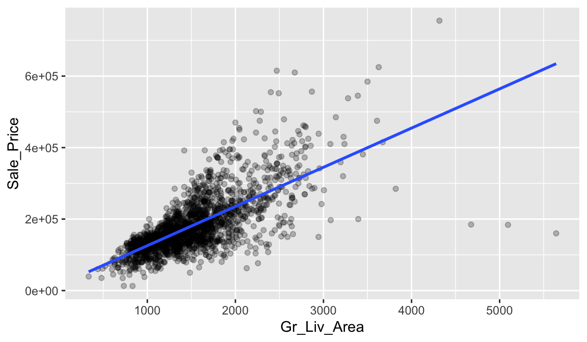
The line in the above plot is called a “regression line.” The regression line is a visual summary of the relationship between two numerical variables, in our case the outcome variable Sale_Price and the explanatory variable Gr_Liv_Area. The positive slope of the blue line is consistent with our earlier observed correlation coefficient of 0.71 suggesting that there is a positive relationship between these two variables.
5.4.2 Estimating “best fit”
You may recall from secondary/high school algebra that the equation of a line is \(y = a + b \times x\). Often, in formulas like these we illustrate multiplication without the \(\times\) symbol like the following \(y = a + bx\). The equation of our line is defined by two coefficients \(a\) and \(b\). The intercept coefficient \(a\) is the value of \(y\) when \(x = 0\). The slope coefficient \(b\) for \(x\) is the increase in \(y\) for every increase of one in \(x\). This is also called the “rise over run.”
However, when defining a regression line like the regression line in the previous plot, we use slightly different notation: the equation of the regression line is \(\widehat{y} = b_0 + b_1 x\). The intercept coefficient is \(b_0\), so \(b_0\) is the value of \(\widehat{y}\) when \(x = 0\). The slope coefficient for \(x\) is \(b_1\), i.e., the increase in \(\widehat{y}\) for every increase of one unit in \(x\). Why do we put a “hat” on top of the \(y\)? It’s a form of notation commonly used in regression to indicate that we have a “fitted value,” or the value of \(y\) on the regression line for a given \(x\) value.
So what are the coefficients of our best fit line that characterizes the relationship between Gr_Liv_Area and Sale_Price? We can get that by fitting an SLR model where Sale_Price is our response variable and Gr_Liv_Area is our single predictor variable.
Once our model is fit we can extract our fitted model results with tidy():
model1 <- linear_reg() %>%
fit(Sale_Price ~ Gr_Liv_Area, data = ames_train)
tidy(model1)
## # A tibble: 2 × 5
## term estimate std.error statistic p.value
## <chr> <dbl> <dbl> <dbl> <dbl>
## 1 (Intercept) 15938. 3852. 4.14 3.65e- 5
## 2 Gr_Liv_Area 110. 2.42 45.3 5.17e-311The estimated coefficients from our model are \(b_0 =\) 15938.17 and \(b_1 =\) 109.67. To interpret, we estimate that the mean selling price increases by 109.67 for each additional one square foot of above ground living space.
With these coefficients, we can look at our scatter plot again (this time with the x & y axes formatted) and compare the characterization of our linear line with the coefficients. This simple description of the relationship between the sale price and square footage using a single number (i.e., the slope) is what makes linear regression such an intuitive and popular modeling tool.
ggplot(ames_train, aes(Gr_Liv_Area, Sale_Price)) +
   geom_point(size = 1.5, alpha = .25) +
geom_smooth(method = "lm", se = FALSE) +
scale_x_continuous(labels = scales::comma) +
scale_y_continuous(labels = scales::dollar)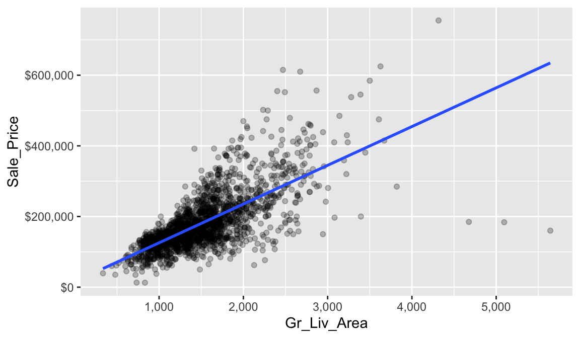
This is great but you may still be asking how we are estimating the coefficients? Ideally, we want estimates of \(b_0\) and \(b_1\) that give us the “best fitting” line. But what is meant by “best fitting”? The most common approach is to use the method of least squares (LS) estimation; this form of linear regression is often referred to as ordinary least squares (OLS) regression. There are multiple ways to measure “best fitting”, but the LS criterion finds the “best fitting” line by minimizing the residual sum of squares (RSS).
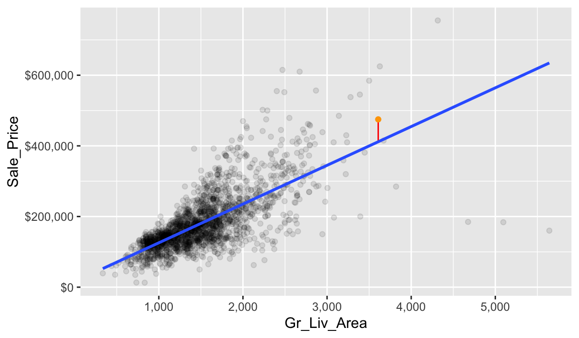
Before we define RSS, let’s first define what a residual is. Let’s look at a single home. This home has 3,608 square feet of living space and sold for $475,000. In other words, \(x = 3608\) and \(y = 475000\).
## # A tibble: 1 × 2
##   Gr_Liv_Area Sale_Price
##         <int>      <int>
## 1        3608     475000
Based on our linear regression model (or the intercept and slope we identified from our model) our best fit line estimates that this house’s sale price is
\[\widehat{y} = b_0 + b_1 \times x = 15938.1733 + 109.6675 \times 3608 = 411618.5\]
We can visualize this in our plot where we have the actual Sale_Price (orange) and the estimated Sale_Price based on our fitted line. The difference between these two values (\(y - \widehat{y} = 475000 - 411618.5 = 63381.5\)) is what we call our residual. It is considered the error for this observation, which we can visualize with the red line.
Now, if we look across all our data points you will see that each one has a residual associated with it. In the right plot, the vertical lines represent the individual residuals/errors associated with each observation.
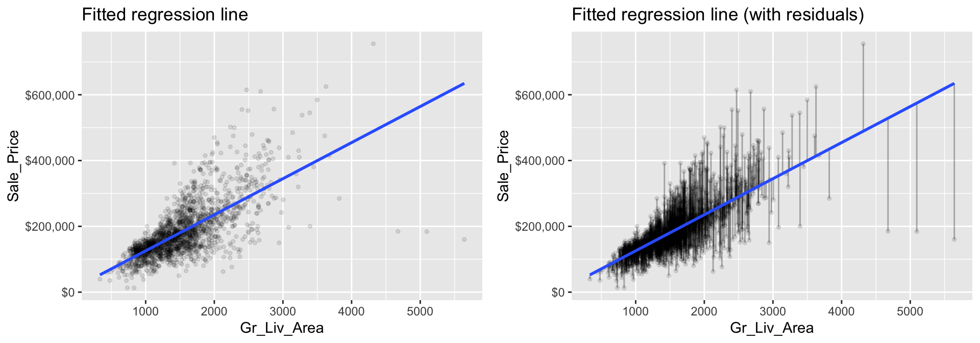
Figure 5.1: The least squares fit from regressing sale price on living space for the the Ames housing data. Left: Fitted regression line. Right: Fitted regression line with vertical grey bars representing the residuals.
The OLS criterion identifies the “best fitting” line that minimizes the sum of squares of these residuals. Mathematically, this is computed by taking the sum of the squared residuals (or as stated before the residual sum of squares –> “RSS”).
\[\begin{equation} RSS = \sum_{i=1}^n\left(y_i - \widehat{y_i}\right)^2 \end{equation}\]
where \(y_i\) and \(\widehat{y_i}\) just mean the actual and predicted response values for the ith observation.
5.4.3 Inference
Let’s go back to our model1 results that show the \(b_0\) and \(b_1\) coefficient values:
tidy(model1)
## # A tibble: 2 × 5
##   term        estimate std.error statistic   p.value
##   <chr>          <dbl>     <dbl>     <dbl>     <dbl>
## 1 (Intercept)   15938.   3852.        4.14 3.65e-  5
## 2 Gr_Liv_Area     110.      2.42     45.3  5.17e-311
Note that we call these coefficient values “estimates.” Due to various reasons we should always assume that there is some variability in our estimated coefficient values. The variability of an estimate is often measured by its standard error (SE). When we fit our linear regression model the SE for each coefficient was computed for us and are displayed in the column labeled std.error in the output from tidy().
From this, we can also derive simple \(t\)-tests to understand if the individual coefficients are statistically significant from zero. The t-statistics for such a test are nothing more than the estimated coefficients divided by their corresponding estimated standard errors (i.e., in the output from tidy(), t value (aka statistic) = estimate / std.error). The reported t-statistics measure the number of standard deviations each coefficient is away from 0. Thus, large t-statistics (greater than two in absolute value, say) roughly indicate statistical significance at the \(\alpha = 0.05\) level. The p-values for these tests are also reported by tidy() in the column labeled p.value.
This may seem quite complicated but don’t worry, R will do the heavy
lifting for us. Just realize we can use these additional statistics
provided in our model summary to tell us if the predictor variable
(Gr_Liv_Area in our example) has a statistically
significant relationship with our response variable.
When the p.value for a given coefficient is quite small (i.e. p.value < 0.005), that is a good indication that the estimate for that coefficient is statistically different than zero. For example, the p.value for the Gr_Liv_Area coefficient is 5.17e-311 (basically zero). This means that the estimated coefficient value of 109.6675 is statistically different than zero.
Let’s look at this from another perspective. We can compute the 95% confidence intervals for the coefficients in our SLR example.
confint(model1$fit, level = 0.95)
##                2.5 %     97.5 %
## (Intercept) 8384.213 23492.1336
## Gr_Liv_Area  104.920   114.4149
To interpret, we estimate with 95% confidence that the mean selling price increases between 104.92 and 114.41 for each additional one square foot of above ground living space. We can also conclude that the slope \(b_1\) is significantly different from zero (or any other pre-specified value not included in the interval) at the \(\alpha = 0.05\) level (\(\alpha = 0.05\) because we just take 1 - confidence level we are computing so \(1 - 0.95 = 0.05\)).
5.4.4 Knowledge check
Let’s revisit the relationship between Year_Built and
Sale_Price. Using the ames_train data:
- Visualize the relationship between these two variables.
- Compute their correlation.
-
Create a simple linear regression model where
Sale_Priceis a function ofYear_Built. -
Interpret the coefficient for
Year_Built. - What is the 95% confidence interval for this coefficient and can we confidently say it is statistically different than zero?
5.5 Making predictions
We’ve created a simple linear regression model to describe the relationship between Gr_Liv_Area and Sale_Price. As we saw in the last module, we can make predictions with this model.
model1 %>%
   predict(ames_train)
## # A tibble: 2,049 × 1
##      .pred
##      <dbl>
##  1 135695.
##  2 135695.
##  3 107620.
##  4  98408.
##  5 126922.
##  6 224526.
##  7 114639.
##  8 129992.
##  9 205444.
## 10 132515.
## # ℹ 2,039 more rows
And we can always add these predictions back to our training data if we want to look at how the predicted values differ from the actual values.
model1 %>%
   predict(ames_train) %>%
   bind_cols(ames_train) %>%
   select(Gr_Liv_Area, Sale_Price, .pred)
## # A tibble: 2,049 × 3
##    Gr_Liv_Area Sale_Price   .pred
##          <int>      <int>   <dbl>
##  1        1092     105500 135695.
##  2        1092      88000 135695.
##  3         836     120000 107620.
##  4         752     125000  98408.
##  5        1012      67500 126922.
##  6        1902     112000 224526.
##  7         900     122000 114639.
##  8        1040     127000 129992.
##  9        1728      84900 205444.
## 10        1063     128000 132515.
## # ℹ 2,039 more rows
5.6 Assessing model accuracy
This allows us to assess the accuracy of our model. Recall from the last module that for regression models we often use mean squared error (MSE) and root mean squared error (RMSE) to quantify the accuracy of our model. These two values are directly correlated to the RSS we discussed above, which determines the best fit line. Let’s illustrate.
5.6.1 Training data accuracy
Recall that the residuals are the differences between the actual \(y\) and the estimated \(\widehat{y}\) based on the best fit line.
residuals <- model1 %>%
   predict(ames_train) %>%
   bind_cols(ames_train) %>%
   select(Gr_Liv_Area, Sale_Price, .pred) %>%
   mutate(residual = Sale_Price - .pred)

head(residuals, 5)
## # A tibble: 5 × 4
##   Gr_Liv_Area Sale_Price   .pred residual
##         <int>      <int>   <dbl>    <dbl>
## 1        1092     105500 135695.  -30195.
## 2        1092      88000 135695.  -47695.
## 3         836     120000 107620.   12380.
## 4         752     125000  98408.   26592.
## 5        1012      67500 126922.  -59422.
The RSS squares these values and then sums them.
residuals %>%
   mutate(squared_residuals = residual^2) %>%
   summarize(sum_of_squared_residuals = sum(squared_residuals))
## # A tibble: 1 × 1
##   sum_of_squared_residuals
##                      <dbl>
## 1                  6.60e12
Why do we square the residuals? So that both positive and negative deviations of the same amount are treated equally. While taking the absolute value of the residuals would also treat both positive and negative deviations of the same amount equally, squaring the residuals is used for reasons related to calculus: taking derivatives and minimizing functions. If you’d like to learn more we suggest you consult one of the textbooks referenced at the end of the lesson.
However, when expressing the performance of a model we rarely state the RSS. Instead it is more common to state the average of the squared error, or the MSE as discussed here. Unfortunately, both the RSS and MSE are not very intuitive because the units the metrics are expressed in do have much meaning. So, we usually use the RMSE metric, which simply takes the square root of the MSE metric so that your error metric is in the same units as your response variable.
We can manually compute this with the following, which tells us that on average, our linear regression model mispredicts the expected sale price of a home by about $56,760.
residuals %>%
   mutate(squared_residuals = residual^2) %>%
   summarize(
      MSE = mean(squared_residuals),
      RMSE = sqrt(MSE)
      )
## # A tibble: 1 × 2
##           MSE   RMSE
##         <dbl>  <dbl>
## 1 3221722037. 56760.
We could also compute this using the rmse() function we saw in the last module:
5.6.2 Test data accuracy
Recall that a major goal of the machine learning process is to find a model that most accurately predicts future values based on a set of features. In other words, we want an algorithm that not only fits well to our past data, but more importantly, one that predicts a future outcome accurately. In the last module we called this our generalization error.
So, ultimately, we want to understand how well our model will generalize to unseen data. To do this we need to compute the RMSE of our model on our test set.
Here, we see that our test RMSE is right around the same as our training data. As we’ll see in later modules, this is not always the case.
5.6.3 Knowledge check
Let’s revisit the simple linear regression model you created earlier
with Year_Built and Sale_Price.
- Using this model, make predictions using the test data. What is the predicted value for the first home in the test data?
- Compute the generalization RMSE for this model.
- Interpret the generalization RMSE.
-
How does this model compare to the model based on
Gr_Liv_Area?
5.7 Exercises
Using the Boston housing data set where the response feature is the
median value of homes within a census tract (cmedv):
- Split the data into 70-30 training-test sets.
-
Using the training data, pick a single feature variable and…
-
Visualize the relationship between that feature and
cmedv. -
Compute the correlation between that feature and
cmedv. -
Create a simple linear regression model with
cmedvas a function of that feature variable. - Interpret the feature’s coefficient.
- What is the model’s generalization error?
-
Visualize the relationship between that feature and
- Now pick another feature variable and repeat the process in #2.