Chapter 16 Interpretable Machine Learning
In the previous chapters you learned how to train several different forms of advanced ML models. Often, these models are considered “black boxes” due to their complex inner-workings. However, because of their complexity, they are typically more accurate for predicting nonlinear, faint, or rare phenomena. Unfortunately, more accuracy often comes at the expense of interpretability, and interpretability is crucial for business adoption, model documentation, regulatory oversight, and human acceptance and trust. Luckily, several advancements have been made to aid in interpreting ML models over the years and this chapter demonstrates how you can use them to extract important insights. Interpreting ML models is an emerging field that has become known as interpretable machine learning (IML).
16.1 Prerequisites
There are multiple packages that provide robust machine learning interpretation capabilities. Unfortunately there is not one single package that is optimal for all IML applications; rather, when performing IML you will likely use a combination of packages. The following packages are used in this chapter.
# Helper packages
library(dplyr)      # for data wrangling
library(ggplot2)    # for awesome graphics

# Modeling packages
library(h2o)       # for interfacing with H2O
library(recipes)   # for ML recipes
library(rsample)   # for data splitting
library(xgboost)   # for fitting GBMs

# Model interpretability packages
library(pdp)       # for partial dependence plots (and ICE curves)
library(vip)       # for variable importance plots
library(iml)       # for general IML-related functions
library(DALEX)     # for general IML-related functions
library(lime)      # for local interpretable model-agnostic explanations
To illustrate various concepts we’ll continue working with the h2o version of the Ames housing example from Section 15.1. We’ll also use the stacked ensemble model (ensemble_tree) created in Section 15.3.
16.2 The idea
It is not enough to identify a machine learning model that optimizes predictive performance; understanding and trusting model results is a hallmark of good science and necessary for our model to be adopted. As we apply and embed ever-more complex predictive modeling and machine learning algorithms, both we (the analysts) and the business stakeholders need methods to interpret and understand the modeling results so we can have trust in its application for business decisions (Doshi-Velez and Kim 2017).
Advancements in interpretability now allow us to extract key insights and actionable information from the most advanced ML models. These advancements allow us to answer questions such as:
- What are the most important customer attributes driving behavior?
- How are these attributes related to the behavior output?
- Do multiple attributes interact to drive different behavior among customers?
- Why do we expect a customer to make a particular decision?
- Are the decisions we are making based on predicted results fair and reliable?
Approaches to model interpretability to answer the exemplar questions above can be broadly categorized as providing global or local explanations. It is important to understand the entire model that you’ve trained on a global scale, and also to zoom in on local regions of your data or your predictions and derive explanations. Being able to answer such questions and provide both levels of explanation is key to any ML project becoming accepted, adopted, embedded, and properly utilized.
16.2.1 Global interpretation
Global interpretability is about understanding how the model makes predictions, based on a holistic view of its features and how they influence the underlying model structure. It answers questions regarding which features are relatively influential, how these features influence the response variable, and what kinds of potential interactions are occurring. Global model interpretability helps to understand the relationship between the response variable and the individual features (or subsets thereof). Arguably, comprehensive global model interpretability is very hard to achieve in practice. Any model that exceeds a handful of features will be hard to fully grasp as we will not be able to comprehend the whole model structure at once.
While global model interpretability is usually out of reach, there is a better chance to understand at least some models on a modular level. This typically revolves around gaining understanding of which features are the most influential (via feature importance) and then focusing on how the most influential variables drive the model output (via feature effects). Although you may not be able to fully grasp a model with a hundred features, typically only a dozen or so of these variables are really influential in driving the model’s performance. And it is possible to have a firm grasp of how a dozen variables are influencing a model.
16.2.2 Local interpretation
Global interpretability methods help us understand the inputs and their overall relationship with the response variable, but they can be highly deceptive in some cases (e.g., when strong interactions are occurring). Although a given feature may influence the predictive accuracy of our model as a whole, it does not mean that that feature has the largest influence on a predicted value for a given observation (e.g., a customer, house, or employee) or even a group of observations. Local interpretations help us understand what features are influencing the predicted response for a given observation (or small group of observations). These techniques help us to not only answer what we expect a customer to do, but also why our model is making a specific prediction for a given observation.
There are three primary approaches to local interpretation:
- Local interpretable model-agnostic explanations (LIME)
- Shapley values
- Localized step-wise procedures
These techniques have the same objective: to explain which variables are most influential in predicting the target for a set of observations. To illustrate, we’ll focus on two observations. The first is the observation that our ensemble produced the highest predicted Sale_Price for (i.e., observation 1825 which has a predicted Sale_Price of $663,136), and the second is the observation with the lowest predicted Sale_Price (i.e., observation 139 which has a predicted Sale_Price of $47,245.45). Our goal with local interpretation is to explain what features are driving these two predictions.
# Compute predictions
predictions <- predict(ensemble_tree, train_h2o) %>% as.vector()

# Print the highest and lowest predicted sales price
paste("Observation", which.max(predictions),
      "has a predicted sale price of", scales::dollar(max(predictions)))
## [1] "Observation 1825 has a predicted sale price of $663,136"
paste("Observation", which.min(predictions),
      "has a predicted sale price of", scales::dollar(min(predictions)))
## [1] "Observation 139 has a predicted sale price of $47,245.45"

# Grab feature values for observations with min/max predicted sales price
high_ob <- as.data.frame(train_h2o)[which.max(predictions), ] %>% select(-Sale_Price)
low_ob  <- as.data.frame(train_h2o)[which.min(predictions), ] %>% select(-Sale_Price)
16.2.3 Model-specific vs. model-agnostic
It’s also important to understand that there are model-specific and model-agnostic approaches for interpreting your model. Many of the approaches you’ve seen in the previous chapters for understanding feature importance are model-specific. For example, in linear models we can use the absolute value of the \(t\)–statistic as a measure of feature importance (though this becomes complicated when your linear model involves interaction terms and transformations). Random forests, on the other hand, can record the prediction accuracy on the OOB portion of the data, then the same is done after permuting each predictor variable, and the difference between the two accuracies are then averaged over all trees, and normalized by the standard error. These model-specific interpretation tools are limited to their respective model classes. There can be advantages to using model-specific approaches as they are more closely tied to the model performance and they may be able to more accurately incorporate the correlation structure between the predictors (Kuhn and Johnson 2013).
However, there are also some disadvantages. For example, many ML algorithms (e.g., stacked ensembles) have no natural way of measuring feature importance:
vip(ensemble_tree, method = "model")
## Error in vi_model.default(ensemble_tree, method = "model") :
##  model-specific variable importance scores are currently not available for objects of class "h2o.stackedEnsemble.summary".
Furthermore, comparing model-specific feature importance across model classes is difficult since you are comparing different measurements (e.g., the magnitude of \(t\)-statistics in linear models vs. degradation of prediction accuracy in random forests). In model-agnostic approaches, the model is treated as a “black box”. The separation of interpretability from the specific model allows us to easily compare feature importance across different models.
Ultimately, there is no one best approach for model interpretability. Rather, only by applying multiple approaches (to include comparing model specific and model agnostic results) can we really gain full trust in the interpretations we extract.
An important item to note is that when using model agnostic procedures, additional code preparation is often required. For example, the iml (Molnar 2019), DALEX (Biecek 2019), and LIME (Pedersen and Benesty 2018) packages use purely model agnostic procedures. Consequently, we need to create a model agnostic object that contains three components:
- A data frame with just the features (must be of class
"data.frame", cannot be an"H2OFrame"or other object). - A vector with the actual responses (must be numeric—0/1 for binary classification problems).
- A custom function that will take the features from 1), apply the ML algorithm, and return the predicted values as a vector.
The following code extracts these items for the h2o example:
# 1) create a data frame with just the features
features <- as.data.frame(train_h2o) %>% select(-Sale_Price)

# 2) Create a vector with the actual responses
response <- as.data.frame(train_h2o) %>% pull(Sale_Price)

# 3) Create custom predict function that returns the predicted values as a vector
pred <- function(object, newdata)  {
  results <- as.vector(h2o.predict(object, as.h2o(newdata)))
  return(results)
}

# Example of prediction output
pred(ensemble_tree, features) %>% head()
## [1] 207144.3 108958.2 164248.4 241984.2 190000.7 202795.8
Once we have these three components we can create our model agnostic objects for the iml43 and DALEX packages, which will just pass these downstream components (along with the ML model) to other functions.
# iml model agnostic object
components_iml <- Predictor$new(
  model = ensemble_tree,
  data = features,
  y = response,
  predict.fun = pred
)

# DALEX model agnostic object
components_dalex <- DALEX::explain(
  model = ensemble_tree,
  data = features,
  y = response,
  predict_function = pred
)
16.3 Permutation-based feature importance
In previous chapters we illustrated a few model-specific approaches for measuring feature importance (e.g., for linear models we used the absolute value of the \(t\)-statistic). For SVMs, on the other hand, we had to rely on a model-agnostic approach which was based on the permutation feature importance measurement introduced for random forests by Breiman (2001) (see Section 11.6) and expanded on by Fisher, Rudin, and Dominici (2018).
16.3.1 Concept
The permutation approach measures a feature’s importance by calculating the increase of the model’s prediction error after permuting the feature. The idea is that if we randomly permute the values of an important feature in the training data, the training performance would degrade (since permuting the values of a feature effectively destroys any relationship between that feature and the target variable). The permutation approach uses the difference (or ratio) between some baseline performance measure (e.g., RMSE) and the same performance measure obtained after permuting the values of a particular feature in the training data. From an algorithmic perspective, the approach follows these steps:
For any given loss function do the following:
1. Compute loss function for original model
2. For variable i in {1,...,p} do
     | randomize values
     | apply given ML model
     | estimate loss function
     | compute feature importance (some difference/ratio measure
       between permuted loss & original loss)
   End
3. Sort variables by descending feature importance
Algorithm 1: A simple algorithm for computing permutation-based variable importance for the feature set \(X\).
A feature is “important” if permuting its values increases the model error relative to the other features, because the model relied on the feature for the prediction. A feature is “unimportant” if permuting its values keeps the model error relatively unchanged, because the model ignored the feature for the prediction.
This type of variable importance is tied to the model’s performance. Therefore, it is assumed that the model has been properly tuned (e.g., using cross-validation) and is not over fitting.
16.3.2 Implementation
Permutation-based feature importance is available with the DALEX, iml, and vip packages; each providing unique benefits.
The iml package provides the FeatureImp() function which computes feature importance for general prediction models using the permutation approach. It is written in R6 and allows the user to specify a generic loss function or select from a pre-defined list (e.g., loss = "mse" for mean squared error). It also allows the user to specify whether importance is measures as the difference or as the ratio of the original model error and the model error after permutation. The user can also specify the number of repetitions used when permuting each feature to help stabilize the variability in the procedure.
The DALEX package also provides permutation-based variable importance scores through the variable_importance() function. Similar to iml::FeatureImp(), this function allows the user to specify a loss function and how the importance scores are computed (e.g., using the difference or ratio). It also provides an option to sample the training data before shuffling the data to compute importance (the default is to use n_sample = 1000. This can help speed up computation.
The vip package specifically focuses on variable importance plots (VIPs) and provides both model-specific and a number of model-agnostic approaches to computing variable importance, including the permutation approach. With vip you can use customized loss functions (or select from a pre-defined list), perform a Monte Carlo simulation to stabilize the procedure, sample observations prior to permuting features, perform the computations in parallel which can speed up runtime on large data sets, and more.
The following executes a permutation-based feature importance via vip. To speed up execution we sample 50% of the training data but repeat the simulations 5 times to increase stability of our estimates (whenever nsim >, you also get an estimated standard deviation for each importance score). We see that many of the same features that have been influential in model-specific approaches illustrated in previous chapters (e.g., Gr_Liv_Area, Overall_Qual, Total_Bsmt_SF, and Neighborhood) are also considered influential in our stacked model using the permutation approach.
Permutation-based approaches can become slow as the number of predictors grows. This implementation took 9 minutes. You can speed up execution by parallelizing, reducing the sample size, or reducing the number of simulations. However, note that the last two options also increases the variability of the feature importance estimates.
vip(
  ensemble_tree,
  train = as.data.frame(train_h2o),
  method = "permute",
  target = "Sale_Price",
  metric = "RMSE",
  nsim = 5,
  sample_frac = 0.5,
  pred_wrapper = pred
)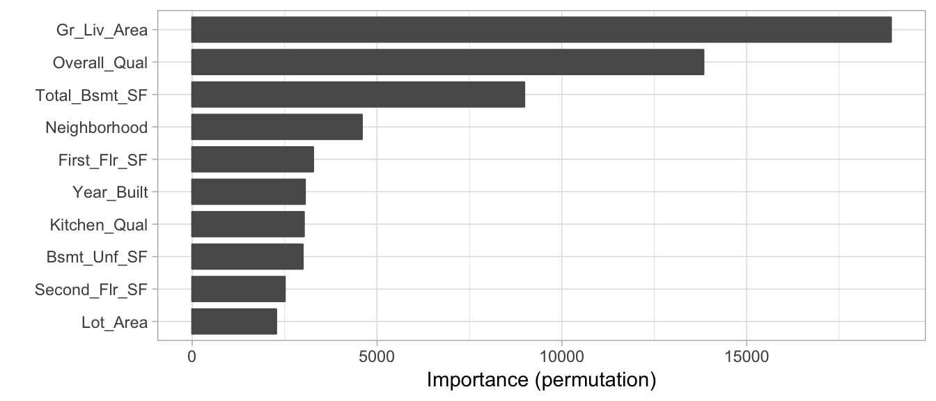
Figure 7.5: Top 10 most influential variables for the stacked H2O model using permutation-based feature importance.
16.4 Partial dependence
Partial dependence helps to understand the marginal effect of a feature (or subset thereof) on the predicted outcome. In essence, it allows us to understand how the response variable changes as we change the value of a feature while taking into account the average effect of all the other features in the model.
16.4.1 Concept
The procedure follows the traditional methodology documented in J. H. Friedman (2001). The algorithm (illustrated below) will split the feature of interest into \(j\) equally spaced values. For example, the Gr_Liv_Area feature ranges from 334–5095 square feet. Say the user selects \(j = 20\). The algorithm will first create an evenly spaced grid consisting of 20 values across the distribution of Gr_Liv_area (e.g., \(334.00, 584.58, \dots, 5095.00\)). Then the algorithm will make 20 copies of the original training data (one copy for each value in the grid). The algorithms will then set Gr_Liv_Area for all observations in the first copy to 334, 585 in the second copy, 835 in the third copy, …, and finally to 5095 in the 20-th copy (all other features remain unchanged). The algorithm then predicts the outcome for each observation in each of the 20 copies, and then averages the predicted values for each set. These averaged predicted values are known as partial dependence values and are plotted against the 20 evenly spaced values for Gr_Liv_Area.
For a selected predictor (x)
1. Construct a grid of j evenly spaced values across the distribution
   of x: {x1, x2, ..., xj}
2. For i in {1,...,j} do
     | Copy the training data and replace the original values of x
       with the constant xi
     | Apply given ML model (i.e., obtain vector of predictions)
     | Average predictions together
   End
3. Plot the averaged predictions against x1, x2, ..., xj
Algorithm 2: A simple algorithm for constructing the partial dependence of the response on a single predictor \(x\).
Algorithm 1 can be quite computationally intensive since it involves \(j\) passes over the training records (and therefore \(j\) calls to the prediction function). Fortunately, the algorithm can be parallelized quite easily (see (Brandon Greenwell 2018) for an example). It can also be easily extended to larger subsets of two or more features as well (i.e., to visualize interaction effects).
If we plot the partial dependence values against the grid values we get what’s known as a partial dependence plot (PDP) (Figure 16.1) where the line represents the average predicted value across all observations at each of the \(j\) values of \(x\).
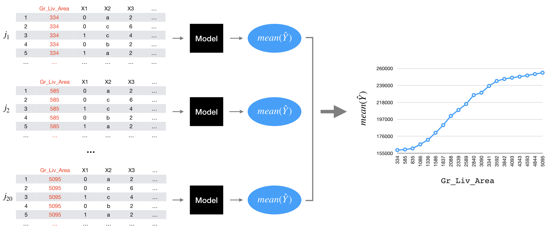
Figure 16.1: Illustration of the partial dependence process.
16.4.2 Implementation
The pdp package (Brandon Greenwell 2018) is a widely used, mature, and flexible package for constructing PDPs. The iml and DALEX packages also provide PDP capabilities.44 pdp has built-in support for many packages but for models that are not supported (such as h2o stacked models) we need to create a custom prediction function wrapper, as illustrated below. First, we create a custom prediction function similar to that which we created in Section 16.2.3; however, here we return the mean of the predicted values. We then use pdp::partial() to compute the partial dependence values.
We can use autoplot() to view PDPs using ggplot2. The rug argument provides markers for the decile distribution of Gr_Liv_Area and when you include rug = TRUE you must also include the training data.
# Custom prediction function wrapper
pdp_pred <- function(object, newdata)  {
  results <- mean(as.vector(h2o.predict(object, as.h2o(newdata))))
  return(results)
}

# Compute partial dependence values
pd_values <- partial(
  ensemble_tree,
  train = as.data.frame(train_h2o),
  pred.var = "Gr_Liv_Area",
  pred.fun = pdp_pred,
  grid.resolution = 20
)
head(pd_values)  # take a peak
##   Gr_Liv_Area     yhat
## 1         334 158858.2
## 2         584 159566.6
## 3         835 160878.2
## 4        1085 165896.7
## 5        1336 171665.9
## 6        1586 180505.1

# Partial dependence plot
autoplot(pd_values, rug = TRUE, train = as.data.frame(train_h2o))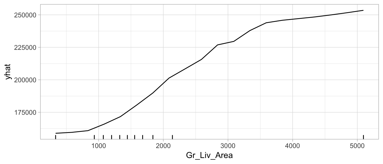
Figure 7.6: Partial dependence plot for Gr_Liv_Area illustrating the average increase in predicted Sale_Price as Gr_Liv_Area increases.
16.4.3 Alternative uses
PDPs have primarily been used to illustrate the marginal effect a feature has on the predicted response value. However, Brandon M Greenwell, Boehmke, and McCarthy (2018) illustrate an approach that uses a measure of the relative “flatness” of the partial dependence function as a measure of variable importance. The idea is that those features with larger marginal effects on the response have greater importance. You can implement a PDP-based measure of feature importance by using the vip package and setting method = "pdp". The resulting variable importance scores also retain the computed partial dependence values (so you can easily view plots of both feature importance and feature effects).
16.5 Individual conditional expectation
Individual conditional expectation (ICE) curves (Goldstein et al. 2015) are very similar to PDPs; however, rather than averaging the predicted values across all observations we observe and plot the individual observation-level predictions.
16.5.1 Concept
An ICE plot visualizes the dependence of the predicted response on a feature for each instance separately, resulting in multiple lines, one for each observation, compared to one line in partial dependence plots. A PDP is the average of the lines of an ICE plot. Note that the following algorithm is the same as the PDP algorithms except for the last line where PDPs averaged the predicted values.
For a selected predictor (x)
1. Construct a grid of j evenly spaced values across the distribution
   of x: {x1, x2, ..., xj}
2. For i in {1,...,j} do
     | Copy the training data and replace the original values of x
       with the constant xi
     | Apply given ML model (i.e., obtain vector of predictions)
   End
3. Plot the predictions against x1, x2, ..., xj with lines connecting
   oberservations that correspond to the same row number in the original
   training data
Algorithm 3: A simple algorithm for constructing the individual conditional expectation of the response on a single predictor \(x\).
So, what do you gain by looking at individual expectations, instead of partial dependencies? PDPs can obfuscate heterogeneous relationships that result from strong interaction effects. PDPs can show you what the average relationship between feature \(x_s\) and the predicted value (\(\widehat{y}\)) looks like. This works only well in cases where the interactions between features are weak but in cases where interactions exist, ICE curves will help to highlight this. One issue to be aware of, often differences in ICE curves can only be identified by centering the feature. For example, ~ref(fig:ice-illustration) below displays ICE curves for the Gr_Liv_Area feature. The left plot makes it appear that all observations have very similar effects across Gr_Liv_Area values. However, the right plot shows centered ICE (c-ICE) curves which helps to highlight heterogeneity more clearly and also draws more attention to those observations that deviate from the general pattern.
You will typically see ICE curves centered at the minimum value of the feature. This allows you to see how effects change as the feature value increases.
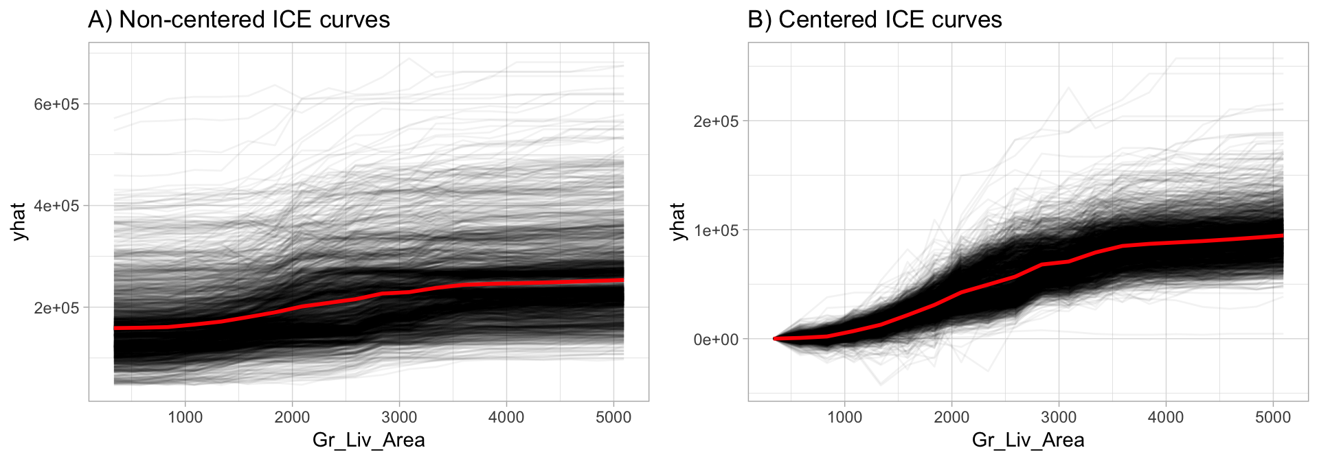
Figure 16.2: Non-centered (A) and centered (B) ICE curves for Gr_Liv_Area illustrating the observation-level effects (black lines) in predicted Sale_Price as Gr_Liv_Area increases. The plot also illustrates the PDP line (red), representing the average values across all observations.
16.5.2 Implementation
Similar to PDPs, the premier package to use for ICE curves is the pdp package; however, the iml package also provides ICE curves. To create ICE curves with the pdp package we follow the same procedure as with PDPs; however, we exclude the averaging component (applying mean()) in the custom prediction function. By default, autoplot() will plot all observations; we also include center = TRUE to center the curves at the first value.
Note that we use pred.fun = pred. This is using the same custom prediction function created in Section 16.2.3.
# Construct c-ICE curves
partial(
  ensemble_tree,
  train = as.data.frame(train_h2o),
  pred.var = "Gr_Liv_Area",
  pred.fun = pred,
  grid.resolution = 20,
  plot = TRUE,
  center = TRUE,
  plot.engine = "ggplot2"
)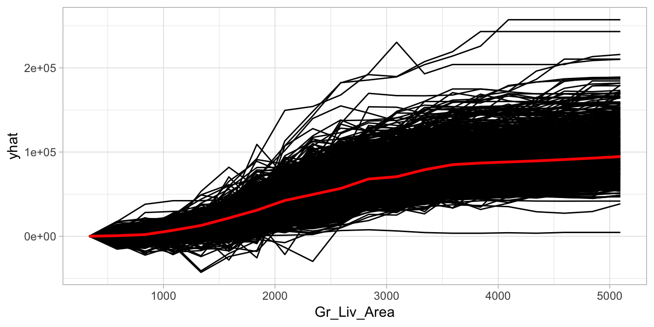
Figure 16.3: Centered ICE curve for Gr_Liv_Area illustrating the observation-level effects in predicted Sale_Price as Gr_Liv_Area increases.
16.6 Feature interactions
When features in a prediction model interact with each other, the influence of the features on the prediction surface is not additive but more complex. In real life, most relationships between features and some response variable are complex and include interactions. This is largely why more complex algorithms (especially tree-based algorithms) tend to perform very well—the nature of their complexity often allows them to naturally capture complex interactions. However, identifying and understanding the nature of these interactions is difficult.
One way to estimate the interaction strength is to measure how much of the variation of the predicted outcome depends on the interaction of the features. This measurement is called the \(H\)-statistic and was introduced by Friedman, Popescu, and others (2008).
16.6.1 Concept
There are two main approaches to assessing interactions with the \(H\)-statistic:
- The interaction between two features, which tells us how strongly two specific features interact with each other in the model;
- The interaction between a feature and all other features, which tells us how strongly (in total) the specific feature interacts in the model with all the other features.
To measure both types of interactions, we leverage partial dependence values for the features of interest. For the first approach, which measures how a feature (\(x_i\)) interacts with all other features. The algorithm performs the following steps:
1. For variable i in {1,...,p} do
     | f(x) = estimate predicted values with original model
     | pd(x) = partial dependence of variable i
     | pd(!x) = partial dependence of all features excluding i
     | upper = sum(f(x) - pd(x) - pd(!x))
     | lower = variance(f(x))
     | rho = upper / lower
   End
2. Sort variables by descending rho (interaction strength)
Algorithm 4: A simple algorithm for measuring the interaction strength between \(x_i\) and all other features.
For the second approach, which measures the two-way interaction strength of feature \(x_i\) and \(x_j\), the algorithm performs the following steps:
1. i = a selected variable of interest
2. For remaining variables j in {1,...,p} do
     | pd(ij) = interaction partial dependence of variables i and j
     | pd(i) = partial dependence of variable i
     | pd(j) = partial dependence of variable j
     | upper = sum(pd(ij) - pd(i) - pd(j))
     | lower = variance(pd(ij))
     | rho = upper / lower
   End
3. Sort interaction relationship by descending rho (interaction strength)
Algorithm 5: A simple algorithm for measuring the interaction strength between \(x_i\) and \(x_j\).
In essence, the \(H\)-statistic measures how much of the variation of the predicted outcome depends on the interaction of the features. In both cases, \(\rho = \text{rho}\) represents the interaction strength, which will be between 0 (when there is no interaction at all) and 1 (if all of variation of the predicted outcome depends on a given interaction).
16.6.2 Implementation
Currently, the iml package provides the only viable implementation of the \(H\)-statistic as a model-agnostic application. We use Interaction$new() to compute the one-way interaction to assess if and how strongly two specific features interact with each other in the model. We find that First_Flr_SF has the strongest interaction (although it is a weak interaction since \(\rho < 0.139\) ).
Unfortunately, due to the algorithm complexity, the \(H\)-statistic is very computationally demanding as it requires \(2n^2\) runs. This example of computing the one-way interaction \(H\)-statistic took two hours to complete! However, iml does allow you to speed up computation by reducing the grid.size or by parallelizing computation with parallel = TRUE. See vignette(“parallel”, package = “iml”) for more info.
interact <- Interaction$new(components_iml)

interact$results %>%
  arrange(desc(.interaction)) %>%
  head()
##        .feature .interaction
## 1  First_Flr_SF   0.13917718
## 2  Overall_Qual   0.11077722
## 3  Kitchen_Qual   0.10531653
## 4 Second_Flr_SF   0.10461824
## 5      Lot_Area   0.10389242
## 6   Gr_Liv_Area   0.09833997

plot(interact)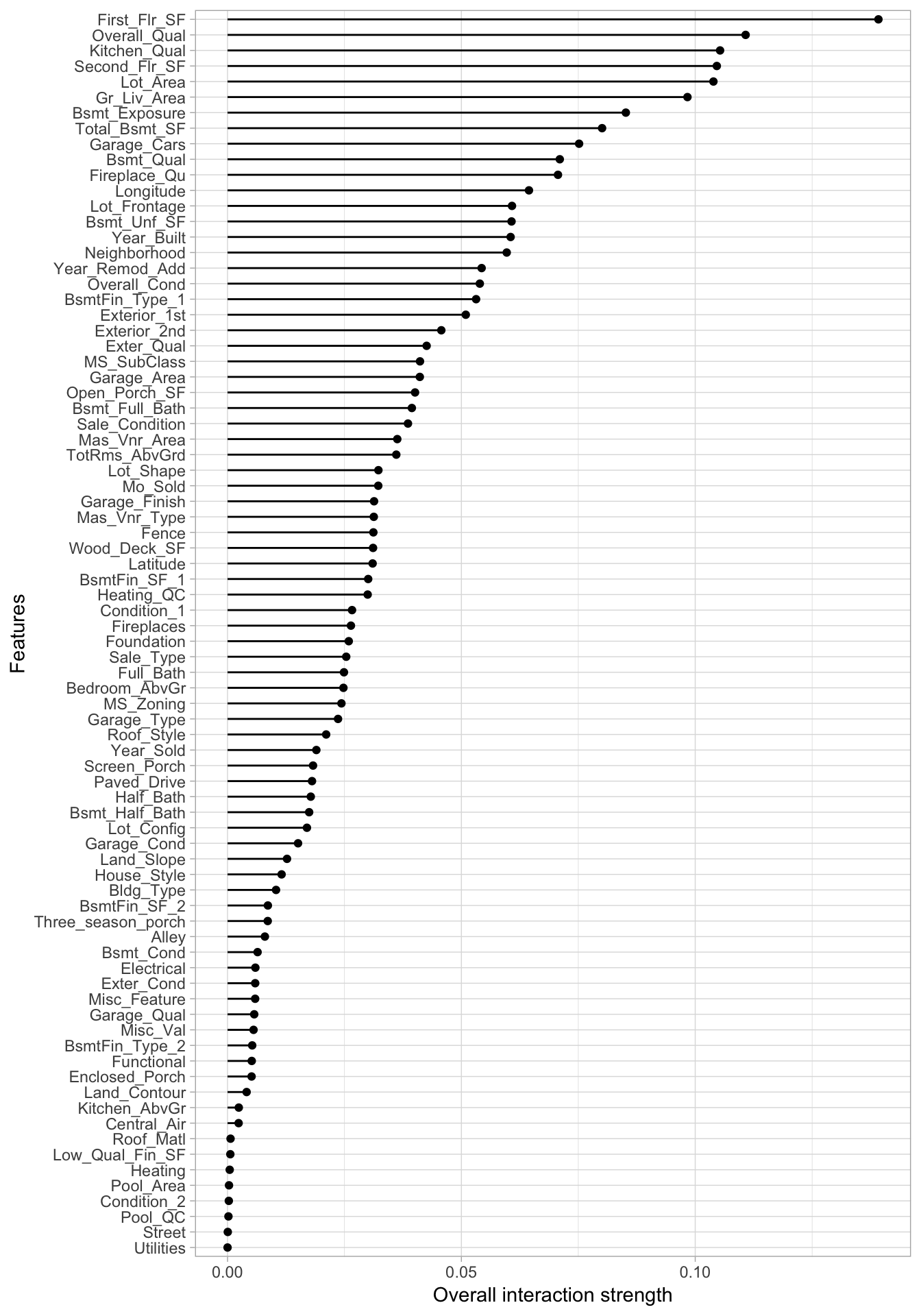
Figure 16.4: \(H\)-statistics for the 80 predictors in the Ames Housing data based on the H2O ensemble model.
Once we’ve identified the variable(s) with the strongest interaction signal (First_Flr_SF in our case), we can then compute the \(h\)-statistic to identify which features it mostly interacts with. This second iteration took over two hours and identified Overall_Qual as having the strongest interaction effect with First_Flr_SF (again, a weak interaction effect given \(\rho = 0.144\) ).
interact_2way <- Interaction$new(components_iml, feature = "First_Flr_SF")
interact_2way$results %>%
  arrange(desc(.interaction)) %>%
  top_n(10)
##                      .feature .interaction
## 1   Overall_Qual:First_Flr_SF   0.14385963
## 2     Year_Built:First_Flr_SF   0.09314573
## 3   Kitchen_Qual:First_Flr_SF   0.06567883
## 4      Bsmt_Qual:First_Flr_SF   0.06228321
## 5  Bsmt_Exposure:First_Flr_SF   0.05900530
## 6  Second_Flr_SF:First_Flr_SF   0.05747438
## 7  Kitchen_AbvGr:First_Flr_SF   0.05675684
## 8    Bsmt_Unf_SF:First_Flr_SF   0.05476509
## 9     Fireplaces:First_Flr_SF   0.05470992
## 10  Mas_Vnr_Area:First_Flr_SF   0.05439255
Identifying these interactions can help point us in the direction of assessing how the interactions relate to the response variable. We can use PDPs or ICE curves with interactions to see their effect on the predicted response. Since the above process pointed out that First_Flr_SF and Overall_Qual had the highest interaction effect, the code plots this interaction relationship with predicted Sale_Price. We see that properties with “good” or lower Overall_Qual values tend have their Sale_Prices level off as First_Flr_SF increases moreso than properties with really strong Overall_Qual values. Also, you can see that properties with “very good” Overall_Qual tend to have a much larger increase in Sale_Price as First_Flr_SF increases from 1500–2000 than most other properties. (Although pdp allows more than one predictor, we take this opportunity to illustrate PDPs with the iml package.)
# Two-way PDP using iml
interaction_pdp <- Partial$new(
  components_iml,
  c("First_Flr_SF", "Overall_Qual"),
  ice = FALSE,
  grid.size = 20
)
plot(interaction_pdp)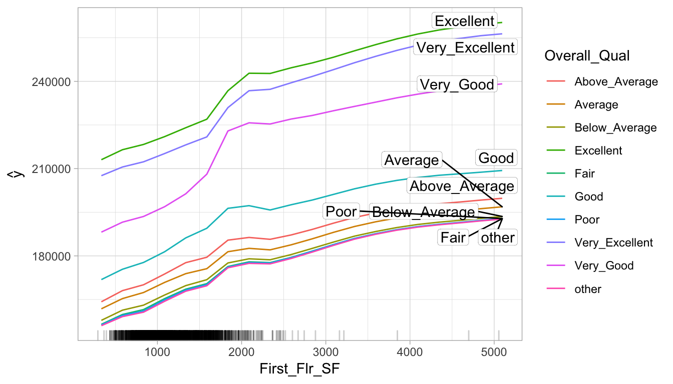
Figure 16.5: Interaction PDP illustrating the joint effect of First_Flr_SF and Overall_Qual on Sale_Price.
16.6.3 Alternatives
Obviously computational time constraints are a major issue in identifying potential interaction effects. Although the \(H\)-statistic is the most statistically sound approach to detecting interactions, there are alternatives. The PDP-based variable importance measure discussed in Brandon M Greenwell, Boehmke, and McCarthy (2018) can also be used to quantify the strength of potential interaction effects. A thorough discussion of this approach is provided by Greenwell, Brandon M. and Boehmke, Bradley C. (2019) and can be implemented with vip::vint(). Also, Kuhn and Johnson (2019) provide a fairly comprehensive chapter discussing alternative approaches for identifying interactions.
16.7 Local interpretable model-agnostic explanations
Local Interpretable Model-agnostic Explanations (LIME) is an algorithm that helps explain individual predictions and was introduced by Ribeiro, Singh, and Guestrin (2016). Behind the workings of LIME lies the assumption that every complex model is linear on a local scale (i.e. in a small neighborhood around an observation of interest) and asserting that it is possible to fit a simple surrogate model around a single observation that will mimic how the global model behaves at that locality.
16.7.1 Concept
To do so, LIME samples the training data multiple times to identify observations that are similar to the individual record of interest. It then trains an interpretable model (often a LASSO model) weighted by the proximity of the sampled observations to the instance of interest. The resulting model can then be used to explain the predictions of the more complex model at the locality of the observation of interest.
The general algorithm LIME applies is:
- Permute your training data to create replicated feature data with slight value modifications.
- Compute proximity measure (e.g., 1 - distance) between the observation of interest and each of the permuted observations.
- Apply selected machine learning model to predict outcomes of permuted data.
- Select m number of features to best describe predicted outcomes.
- Fit a simple model to the permuted data, explaining the complex model outcome with \(m\) features from the permuted data weighted by its similarity to the original observation.
- Use the resulting feature weights to explain local behavior.
Algorithm 6: The generalized LIME algorithm.
Each of these steps will be discussed in further detail as we proceed.
Although the iml package implements the LIME algorithm, the lime package provides the most comprehensive implementation.
16.7.2 Implementation
The implementation of Algorithm 6 via the lime package is split into two operations: lime::lime() and lime::explain(). The lime::lime() function creates an "explainer" object, which is just a list that contains the fitted machine learning model and the feature distributions for the training data. The feature distributions that it contains includes distribution statistics for each categorical variable level and each continuous variable split into \(n\) bins (the current default is four bins). These feature attributes will be used to permute data.
# Create explainer object
components_lime <- lime(
  x = features,
  model = ensemble_tree,
  n_bins = 10
)

class(components_lime)
## [1] "data_frame_explainer" "explainer"            "list"
summary(components_lime)
##                      Length Class              Mode
## model                 1     H2ORegressionModel S4
## preprocess            1     -none-             function
## bin_continuous        1     -none-             logical
## n_bins                1     -none-             numeric
## quantile_bins         1     -none-             logical
## use_density           1     -none-             logical
## feature_type         80     -none-             character
## bin_cuts             80     -none-             list
## feature_distribution 80     -none-             list
Once we’ve created our lime object (i.e., components_lime), we can now perform the LIME algorithm using the lime::explain() function on the observation(s) of interest.
Recall that for local interpretation we are focusing on the two observations identified in Section 16.2.2 that contain the highest and lowest predicted sales prices.
This function has several options, each providing flexibility in how we perform Algorithm 6:
x: Contains the observation(s) you want to create local explanations for. (See step 1 in Algorithm 6.)explainer: Takes the explainer object created bylime::lime(), which will be used to create permuted data. Permutations are sampled from the variable distributions created by thelime::lime()explainer object. (See step 1 in Algorithm 6.)n_permutations: The number of permutations to create for each observation inx(default is 5,000 for tabular data). (See step 1 in Algorithm 6.)dist_fun: The distance function to use. The default is Gower’s distance but can also use Euclidean, Manhattan, or any other distance function allowed by thedist()function (see?dist()for details). To compute similarities, categorical features will be recoded based on whether or not they are equal to the actual observation. If continuous features are binned (the default) these features will be recoded based on whether they are in the same bin as the observation to be explained. Using the recoded data the distance to the original observation is then calculated based on a user-chosen distance measure. (See step 2 in Algorithm 6.)kernel_width: To convert the distance measure to a similarity score, an exponential kernel of a user defined width (defaults to 0.75 times the square root of the number of features) is used. Smaller values restrict the size of the local region. (See step 2 in Algorithm 6.)n_features: The number of features to best describe the predicted outcomes. (See step 4 in Algorithm 6.)feature_select:lime::lime()can use forward selection, ridge regression, lasso, or a decision tree to select the “best”n_featuresfeatures. In the next example we apply a ridge regression model and select the \(m\) features with highest absolute weights. (See step 4 in Algorithm 6.)
For classification models we need to specify a couple of additional arguments:
labels: The specific labels (classes) to explain (e.g., 0/1, “Yes”/“No”)?n_labels: The number of labels to explain (e.g., Do you want to explain both success and failure or just the reason for success?)
# Use LIME to explain previously defined instances: high_ob and low_ob
lime_explanation <- lime::explain(
  x = rbind(high_ob, low_ob),
  explainer = components_lime,
  n_permutations = 5000,
  dist_fun = "gower",
  kernel_width = 0.25,
  n_features = 10,
  feature_select = "highest_weights"
)
If the original ML model is a regressor, the local model will predict the output of the complex model directly. If it is a classifier, the local model will predict the probability of the chosen class(es).
The output from lime::explain() is a data frame containing various information on the local model’s predictions. Most importantly, for each observation supplied it contains the fitted explainer model (model_r2) and the weighted importance (feature_weight) for each important feature (feature_desc) that best describes the local relationship.
glimpse(lime_explanation)
## Observations: 20
## Variables: 11
## $ model_type       <chr> "regression", "regression", "regression", "regr…
## $ case             <chr> "1825", "1825", "1825", "1825", "1825", "1825",…
## $ model_r2         <dbl> 0.41661172, 0.41661172, 0.41661172, 0.41661172,…
## $ model_intercept  <dbl> 186253.6, 186253.6, 186253.6, 186253.6, 186253.…
## $ model_prediction <dbl> 406033.5, 406033.5, 406033.5, 406033.5, 406033.…
## $ feature          <chr> "Gr_Liv_Area", "Overall_Qual", "Total_Bsmt_SF",…
## $ feature_value    <int> 3627, 8, 1930, 35760, 1796, 1831, 3, 14, 1, 3, …
## $ feature_weight   <dbl> 55254.859, 50069.347, 40261.324, 20430.128, 193…
## $ feature_desc     <chr> "2141 < Gr_Liv_Area", "Overall_Qual = Very_Exce…
## $ data             <list> [[Two_Story_1946_and_Newer, Residential_Low_De…
## $ prediction       <dbl> 663136.38, 663136.38, 663136.38, 663136.38, 663…
Visualizing the results in Figure 16.6 we see that size and quality of the home appears to be driving the predictions for both high_ob (high Sale_Price observation) and low_ob (low Sale_Price observation). However, it’s important to note the low \(R^2\) (“Explanation Fit”) of the models. The local model appears to have a fairly poor fit and, therefore, we shouldn’t put too much faith in these explanations.
plot_features(lime_explanation, ncol = 1)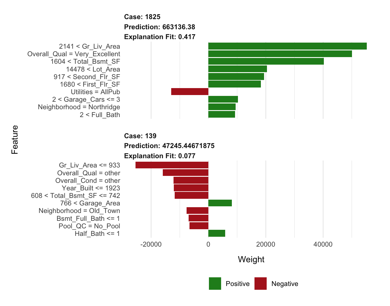
Figure 16.6: Local explanation for observations 1825 (high_ob) and 139 (low_ob) using LIME.
16.7.3 Tuning
Considering there are several knobs we can adjust when performing LIME, we can treat these as tuning parameters to try to tune the local model. This helps to maximize the amount of trust we can have in the local region explanation. As an example, the following code block changes the distance function to be Euclidean, increases the kernel width to create a larger local region, and changes the feature selection approach to a LARS-based LASSO model.
The result is a fairly substantial increase in our explanation fits, giving us much more confidence in their explanations.
# Tune the LIME algorithm a bit
lime_explanation2 <- explain(
  x = rbind(high_ob, low_ob),
  explainer = components_lime,
  n_permutations = 5000,
  dist_fun = "euclidean",
  kernel_width = 0.75,
  n_features = 10,
  feature_select = "lasso_path"
)

# Plot the results
plot_features(lime_explanation2, ncol = 1)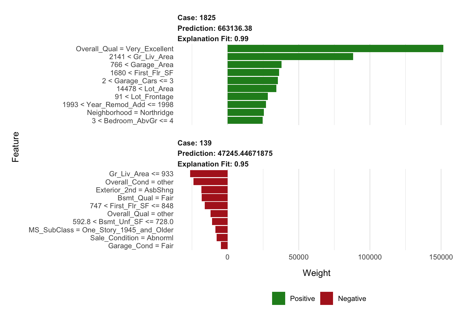
Figure 16.7: Local explanation for observations 1825 (case 1) and 139 (case 2) after tuning the LIME algorithm.
16.7.4 Alternative uses
The discussion above revolves around using LIME for tabular data sets. However, LIME can also be applied to non-traditional data sets such as text and images. For text, LIME creates a new document term matrix with perturbed text (e.g., it generates new phrases and sentences based on existing text). It then follows a similar procedure of weighting the similarity of the generated text to the original. The localized model then helps to identify which words in the perturbed text are producing the strongest signal. For images, variations of the images are created by replacing certain groupings of pixels with a constant color (e.g., gray). LIME then assesses the predicted labels for the given group of pixels not perturbed. For more details on such use cases see Molnar and others (2018).
16.8 Shapley values
Another method for explaining individual predictions borrows ideas from coalitional (or cooperative) game theory to produce whats called Shapley values (Lundberg and Lee 2016, 2017). By now you should realize that when a model gives a prediction for an observation, all features do not play the same role: some of them may have a lot of influence on the model’s prediction, while others may be irrelevant. Consequently, one may think that the effect of each feature can be measured by checking what the prediction would have been if that feature was absent; the bigger the change in the model’s output, the more important that feature is. This is exactly what happens with permutation-based variable importance (since LIME most often uses a ridge or lasso model, it also uses a similar approach to identify localized feature importance).
However, observing only single feature effects at a time implies that dependencies between features are not taken into account, which could produce inaccurate and misleading explanations of the model’s internal logic. Therefore, to avoid missing any interaction between features, we should observe how the prediction changes for each possible subset of features and then combine these changes to form a unique contribution for each feature value.
16.8.1 Concept
The concept of Shapley values is based on the idea that the feature values of an individual observation work together to cause a change in the model’s prediction with respect to the model’s expected output, and it divides this total change in prediction among the features in a way that is “fair” to their contributions across all possible subsets of features.
To do so, Shapley values assess every combination of predictors to determine each predictors impact. Focusing on feature \(x_j\), the approach will test the accuracy of every combination of features not including \(x_j\) and then test how adding \(x_j\) to each combination improves the accuracy. Unfortunately, computing Shapley values is very computationally expensive. Consequently, the iml package implements an approximate Shapley value.
To compute the approximate Shapley contribution of feature \(x_j\) on \(x\) we need to construct two new “Frankenstein” instances and take the difference between their corresponding predictions. This is outlined in the brief algorithm below. Note that this is often repeated several times (e.g., 10–100) for each feature/observation combination and the results are averaged together. See http://bit.ly/fastshap and Štrumbelj and Kononenko (2014) for details.
ob = single observation of interest
1. For variables j in {1,...,p} do
    | m = draw random sample(s) from data set
    | randomly shuffle the feature names, perm <- sample(names(x))
    | Create two new instances b1 and b2 as follows:
      | b1 = x, but all the features in perm that appear after
      |      feature xj get their values swapped with the
      |      corresponding values in z.
      | b2 = x, but feature xj, as well as all the features in perm
      |      that appear after xj, get their values swapped with the
      |      corresponding values in z.
    | f(b1) = compute predictions for b1
    | f(b2) = compute predictions for b2
    | shap_ind = f(b1) - f(b2)
    | phi = mean(shap_ind)
   End
2. Sort phi in decreasing order
Algorithm 7: A simple algorithm for computing approximate Shapley values.
The aggregated Shapley values (\(\phi =\) phi) represent the contribution of each feature towards a predicted value compared to the average prediction for the data set. Figure 16.8, represents the first iteration of our algorithm where we focus on the impact of feature \(X_1\). In step (A) we sample the training data. In step (B) we create two copies of an individually sampled row and randomize the order of the features. Then in one copy we include all values from the observation of interest for the values from the first column feature up to and including \(X_1\). We then include the values from the sampled row for all the other features. In the second copy, we include all values from the observation of interest for the values from the first column feature up to but not including \(X_1\). We use values from the sample row for \(X_1\) and all the other features. Then in step (C), we apply our model to both copies of this row and in step (D) compute the difference between the predicted outputs.
We follow this procedure for all the sampled rows and the average difference across all sampled rows is the Shapley value. It should be obvious that the more observations we include in our sampling procedure the closer our approximate Shapley computation will be to the true Shapley value.
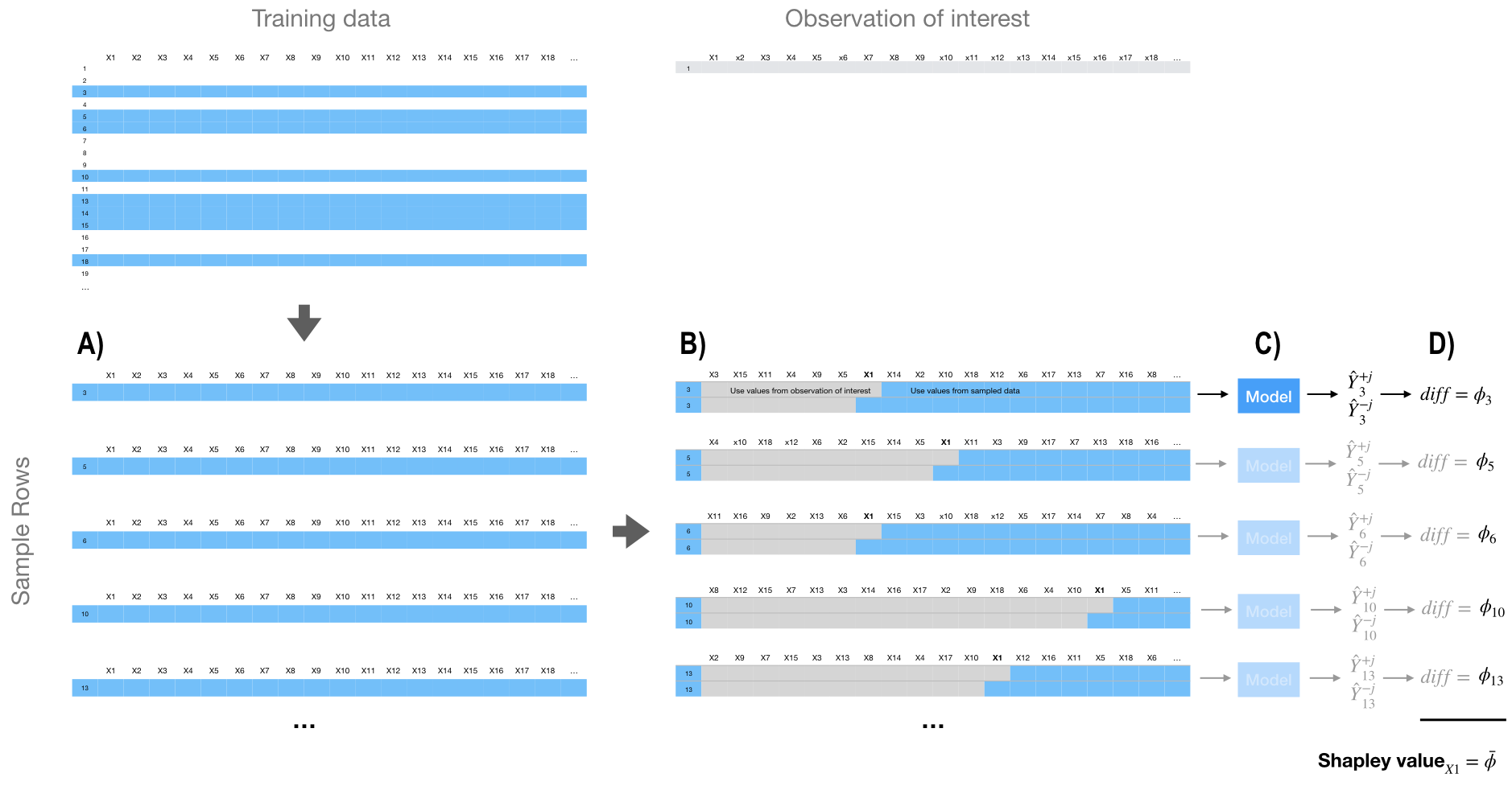
Figure 16.8: Generalized concept behind approximate Shapley value computation.
16.8.2 Implementation
The iml package provides one of the few Shapley value implementations in R. We use Shapley$new() to create a new Shapley object. The time to compute is largely driven by the number of predictors and the sample size drawn. By default, Shapley$new() will only use a sample size of 100 but you can control this to either reduce compute time or increase confidence in the estimated values.
In this example we increased the sample size to 1000 for greater confidence in the estimated values; it took roughly 3.5 minutes to compute.
Looking at the results we see that the predicted sale price of $663,136.38 is $481,797.42 larger than the average predicted sale price of $181,338.96; Figure 16.9 displays the contribution each predictor played in this difference. We see that Gr_Liv_Area, Overall_Qual, and Second_Flr_SF are the top three features positively influencing the predicted sale price; all of which contributed close to, or over, $75,000 towards the $481.8K difference.
# Compute (approximate) Shapley values
(shapley <- Shapley$new(components_iml, x.interest = high_ob, sample.size = 1000))
## Interpretation method:  Shapley
## Predicted value: 663136.380000, Average prediction: 181338.963590 (diff = 481797.416410)
##
## Analysed predictor:
## Prediction task: unknown
##
##
## Analysed data:
## Sampling from data.frame with 2199 rows and 80 columns.
##
## Head of results:
##        feature         phi      phi.var
## 1  MS_SubClass  1746.38653 4.269700e+07
## 2    MS_Zoning   -24.01968 3.640500e+06
## 3 Lot_Frontage  1104.17628 7.420201e+07
## 4     Lot_Area 15471.49017 3.994880e+08
## 5       Street     1.03684 6.198064e+03
## 6        Alley    41.81164 5.831185e+05
##                          feature.value
## 1 MS_SubClass=Two_Story_1946_and_Newer
## 2    MS_Zoning=Residential_Low_Density
## 3                     Lot_Frontage=118
## 4                       Lot_Area=35760
## 5                          Street=Pave
## 6                Alley=No_Alley_Access

# Plot results
plot(shapley)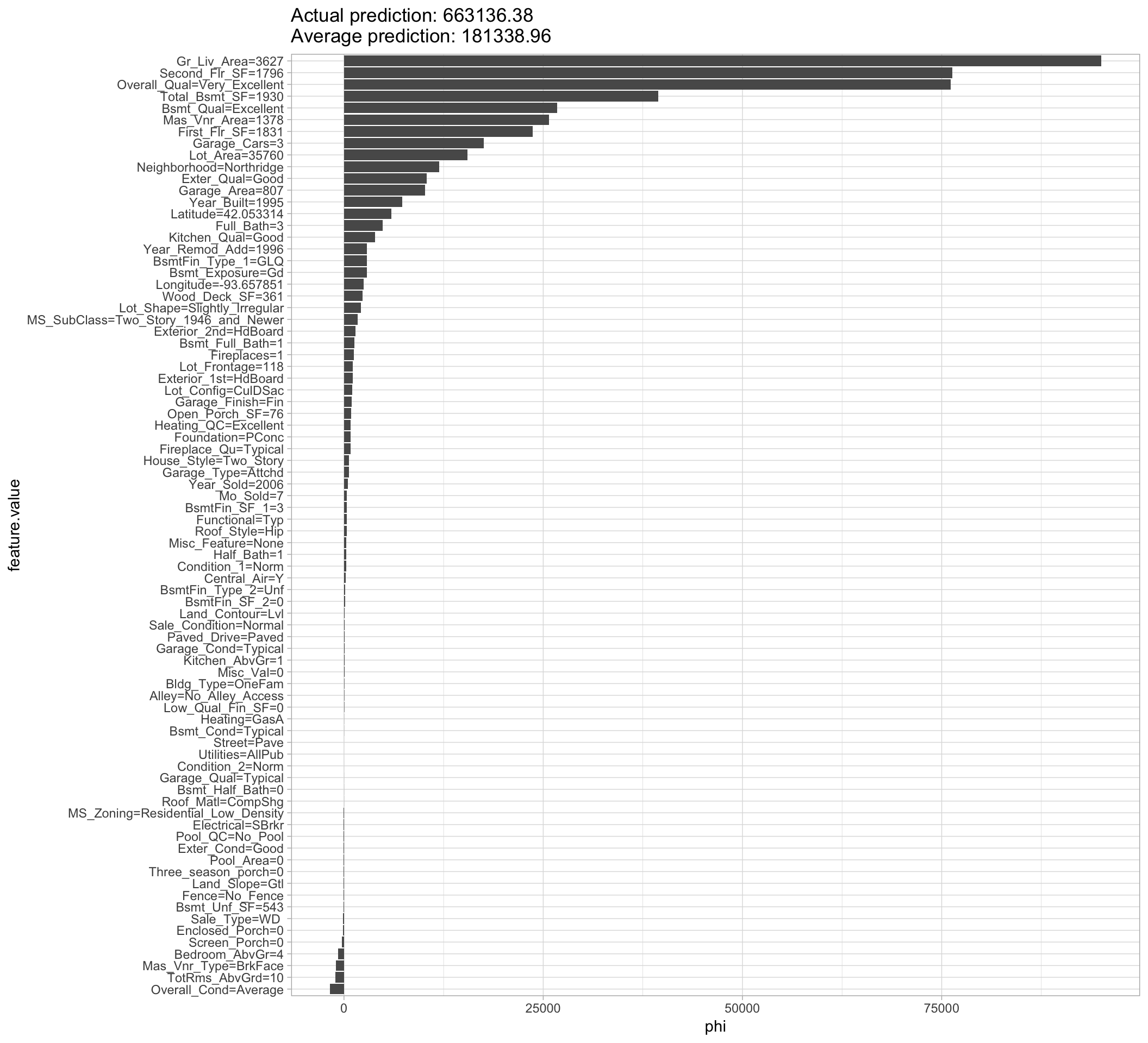
Figure 16.9: Local explanation for observation 1825 using the Shapley value algorithm.
Since iml uses R6, we can reuse the Shapley object to identify the influential predictors that help explain the low Sale_Price observation. In Figure 16.10 we see similar results to LIME in that Overall_Qual and Gr_Liv_Area are the most influential predictors driving down the price of this home.
# Reuse existing object
shapley$explain(x.interest = low_ob)

# Plot results
shapley$results %>%
  top_n(25, wt = abs(phi)) %>%
  ggplot(aes(phi, reorder(feature.value, phi), color = phi > 0)) +
  geom_point(show.legend = FALSE)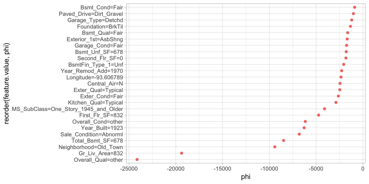
Figure 16.10: Local explanation for observation 139 using the Shapley value algorithm.
16.8.3 XGBoost and built-in Shapley values
True Shapley values are considered theoretically optimal (Lundberg and Lee 2016); however, as previously discussed they are computationally challenging. The approximate Shapley values provided by iml are much more computationally feasible. Another common option is discussed by Lundberg and Lee (2017) and, although not purely model-agnostic, is applicable to tree-based models and is fully integrated in most XGBoost implementations (including the xgboost package). Similar to iml’s approximation procedure, this tree-based Shapley value procedure is also an approximation, but allows for polynomial runtime instead of exponential runtime.
To demonstrate, we’ll use the features used and the final XGBoost model created in Section 12.5.2.
# Compute tree SHAP for a previously obtained XGBoost model
X <- readr::read_rds("data/xgb-features.rds")
xgb.fit.final <- readr::read_rds("data/xgb-fit-final.rds")
The benefit of this expedient approach is we can reasonably compute Shapley values for every observation and every feature in one fell swoop. This allows us to use Shapley values for more than just local interpretation. For example, the following computes and plots the Shapley values for every feature and observation in our Ames housing example; see Figure 16.11. The left plot displays the individual Shapley contributions. Each dot represents a feature’s contribution to the predicted Sale_Price for an individual observation. This allows us to see the general magnitude and variation of each feature’s contributions across all observations. We can use this information to compute the average absolute Shapley value across all observations for each features and use this as a global measure of feature importance (right plot).
There’s a fair amount of general data wrangling going on here but the key line of code is predict(newdata = X, predcontrib = TRUE). This line computes the prediction contribution for each feature and observation in the data supplied via newdata.
# Try to re-scale features (low to high)
feature_values <- X %>%
  as.data.frame() %>%
  mutate_all(scale) %>%
  gather(feature, feature_value) %>%
  pull(feature_value)

# Compute SHAP values, wrangle a bit, compute SHAP-based importance, etc.
shap_df <- xgb.fit.final %>%
  predict(newdata = X, predcontrib = TRUE) %>%
  as.data.frame() %>%
  select(-BIAS) %>%
  gather(feature, shap_value) %>%
  mutate(feature_value = feature_values) %>%
  group_by(feature) %>%
  mutate(shap_importance = mean(abs(shap_value)))

# SHAP contribution plot
p1 <- ggplot(shap_df, aes(x = shap_value, y = reorder(feature, shap_importance))) +
  ggbeeswarm::geom_quasirandom(groupOnX = FALSE, varwidth = TRUE, size = 0.4, alpha = 0.25) +
  xlab("SHAP value") +
  ylab(NULL)

# SHAP importance plot
p2 <- shap_df %>%
  select(feature, shap_importance) %>%
  filter(row_number() == 1) %>%
  ggplot(aes(x = reorder(feature, shap_importance), y = shap_importance)) +
    geom_col() +
    coord_flip() +
    xlab(NULL) +
    ylab("mean(|SHAP value|)")

# Combine plots
gridExtra::grid.arrange(p1, p2, nrow = 1)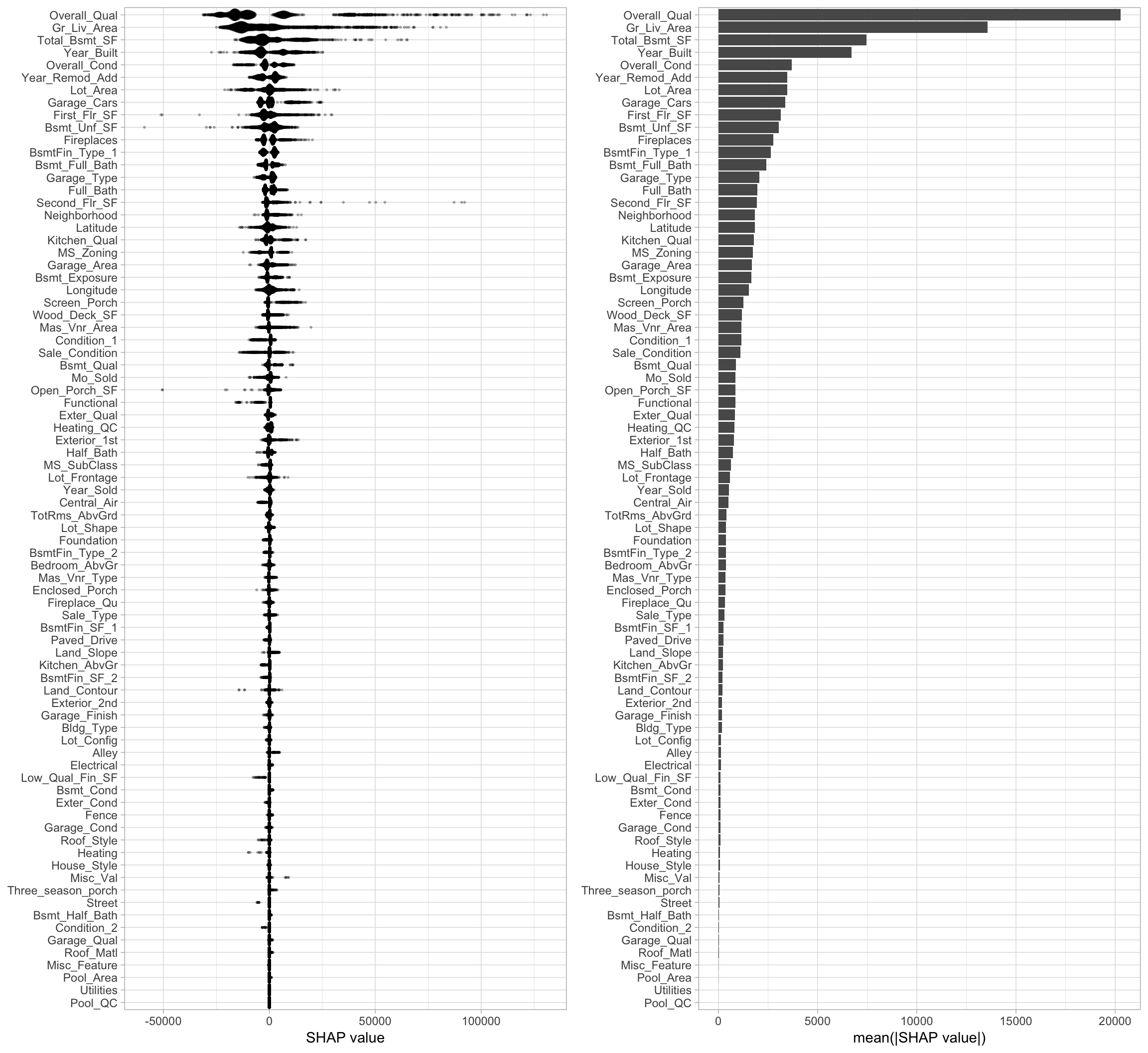
Figure 16.11: Shapley contribution (left) and global importance (right) plots.
We can also use this information to create an alternative to PDPs. Shapley-based dependence plots (Figure 16.12) show the Shapley values of a feature on the \(y\)-axis and the value of the feature for the \(x\)-axis. By plotting these values for all observations in the data set we can see how the feature’s attributed importance changes as its value varies.
shap_df %>%
  filter(feature %in% c("Overall_Qual", "Gr_Liv_Area")) %>%
  ggplot(aes(x = feature_value, y = shap_value)) +
    geom_point(aes(color = shap_value)) +
    scale_colour_viridis_c(name = "Feature value\n(standardized)", option = "C") +
    facet_wrap(~ feature, scales = "free") +
    scale_y_continuous('Shapley value', labels = scales::comma) +
    xlab('Normalized feature value')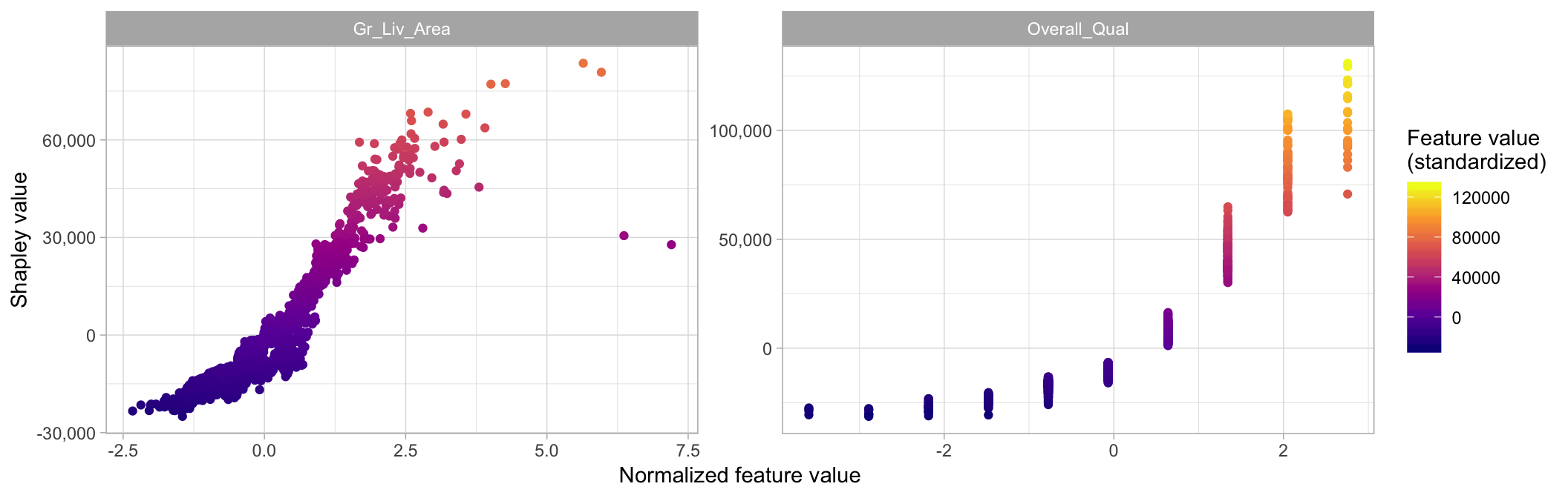
Figure 16.12: Shapley-based dependence plot illustrating the variability in contribution across the range of Gr_Liv_Area and Overall_Qual values.
16.9 Localized step-wise procedure
An additional approach for localized explanation is a procedure that is loosely related to the partial dependence algorithm with an added step-wise procedure. The procedure was introduced by Staniak and Biecek (2018) and is known as the Break Down method, which uses a greedy strategy to identify and remove features iteratively based on their influence on the overall average predicted response.
16.9.1 Concept
The Break Down method provides two sequential approaches; the default is called step up. This procedure, essentially, takes the value for a given feature in the single observation of interest, replaces all the observations in the training data set, and identifies how it effects the prediction error. It performs this process iteratively and independently for each feature, identifies the column with the largest difference score, and adds that variable to the list as the most important. This feature’s signal is then removed (via randomization), and the procedure sweeps through the remaining predictors and applies the same process until all variables have been assessed.
existing_data = validation data set used in explainer
new_ob = single observation to perform local interpretation on
p = number of predictors
l = list of predictors
baseline = mean predicted response of existing_data

for variable i in {1,...,p} do
  for variable j in {1,...,l} do
    | exchange variable j in existing_data with variable j value in new_ob
    | predicted_j = mean predicted response of altered existing_data
    | diff_j = absolute difference between baseline - predicted
    | reset existing_data
    end
  | t = variable j with largest diff value
  | contribution for variable t = diff value for variable t
  | remove variable t from l
  end
Algorithm 8: A simple algorithm for computing Break Down values with the step up method.
An alternative approach is called the step down method which follows a similar algorithm but rather than remove the variable with the largest difference score on each sweep, it removes the variable with the smallest difference score. Both approaches are analogous to backward stepwise selection where step up removes variables with largest impact and step down removes variables with the smallest impact.
16.9.2 Implementation
To perform the Break Down algorithm on a single observation, use the DALEX::prediction_breakdown() function. The output is a data frame with class "prediction_breakdown_explainer" that lists the contribution for each variable. Similar to Shapley values, the results display the contribution that each feature value for the given observation has on the difference between the overall average response (Sale_Price in this example) and the response for the given observation of interest.
The default approach is step up but you can perform step down by specifying direction = “down”.
If you look at the contribution output, realize the feature ordering is in terms of importance. Consequently, Gr_Liv_Area was identified as most influential followed by Second_Flr_SF and Total_Bsmt_SF. However, if you look at the contribution value, you will notice that Second_Flr_SF appears to have a larger contribution to the above average price than Gr_Liv_Area. However, the Second_Flr_SF contribution is based on having already taken Gr_Liv_Area’s contribution into effect.
The break down algorithm is the most computationally intense of all methods discussed in this chapter. Since the number of required iterations increases by \(p \times \left(p-1\right)\) for every additional feature, wider data sets cause this algorithm to become burdensome. For example, this single application took over 6 hours to compute!
high_breakdown <- prediction_breakdown(components_dalex, observation = high_ob)

# class of prediction_breakdown output
class(high_breakdown)
## [1] "prediction_breakdown_explainer" "data.frame"

# check out the top 10 influential variables for this observation
high_breakdown[1:10, 1:5]
##                                      variable contribution variable_name variable_value cummulative
## 1                                 (Intercept)    181338.96     Intercept              1    181338.9
## Gr_Liv_Area              + Gr_Liv_Area = 4316     46971.64   Gr_Liv_Area           4316    228310.5
## Second_Flr_SF          + Second_Flr_SF = 1872     52997.40 Second_Flr_SF           1872    281307.9
## Total_Bsmt_SF          + Total_Bsmt_SF = 2444     41339.89 Total_Bsmt_SF           2444    322647.8
## Overall_Qual  + Overall_Qual = Very_Excellent     47690.10  Overall_Qual Very_Excellent    370337.9
## First_Flr_SF            + First_Flr_SF = 2444     56780.92  First_Flr_SF           2444    427118.8
## Bsmt_Qual             + Bsmt_Qual = Excellent     49341.73     Bsmt_Qual      Excellent    476460.6
## Neighborhood      + Neighborhood = Northridge     54289.27  Neighborhood     Northridge    530749.8
## Garage_Cars                 + Garage_Cars = 3     41959.23   Garage_Cars              3    572709.1
## Kitchen_Qual       + Kitchen_Qual = Excellent     59805.57  Kitchen_Qual      Excellent    632514.6
We can plot the entire list of contributions for each variable using plot(high_breakdown).
16.10 Final thoughts
Since this book focuses on hands-on applications, we have focused on only a small sliver of IML. IML is a rapidly expanding research space that covers many more topics including moral and ethical considerations such as fairness, accountability, and transparency along with many more analytic procedures to interpret model performance, sensitivity, bias identification, and more. Moreover, the above discussion only provides a high-level understanding of the methods. To gain deeper understanding around these methods and to learn more about the other areas of IML (like not discussed in this book) we highly recommend Molnar and others (2018) and Hall, Patrick (2018).
References
Biecek, Przemyslaw. 2019. DALEX: Descriptive mAchine Learning Explanations. https://CRAN.R-project.org/package=DALEX.
Breiman, Leo. 2001. “Random Forests.” Machine Learning 45 (1). Springer: 5–32.
Doshi-Velez, Finale, and Been Kim. 2017. “Towards a Rigorous Science of Interpretable Machine Learning.” arXiv Preprint arXiv:1702.08608.
Fisher, Aaron, Cynthia Rudin, and Francesca Dominici. 2018. “Model Class Reliance: Variable Importance Measures for Any Machine Learning Model Class, from the" Rashomon" Perspective.” arXiv Preprint arXiv:1801.01489.
Friedman, Jerome H. 2001. “Greedy Function Approximation: A Gradient Boosting Machine.” Annals of Statistics. JSTOR, 1189–1232.
Friedman, Jerome H, Bogdan E Popescu, and others. 2008. “Predictive Learning via Rule Ensembles.” The Annals of Applied Statistics 2 (3). Institute of Mathematical Statistics: 916–54.
Goldstein, Alex, Adam Kapelner, Justin Bleich, and Emil Pitkin. 2015. “Peeking Inside the Black Box: Visualizing Statistical Learning with Plots of Individual Conditional Expectation.” Journal of Computational and Graphical Statistics 24 (1). Taylor & Francis: 44–65.
Greenwell, Brandon. 2018. Pdp: Partial Dependence Plots. https://CRAN.R-project.org/package=pdp.
Greenwell, Brandon M. and Boehmke, Bradley C. 2019. “Quantifying the Strength of Potential Interaction Effects.”
Greenwell, Brandon M, Bradley C Boehmke, and Andrew J McCarthy. 2018. “A Simple and Effective Model-Based Variable Importance Measure.” arXiv Preprint arXiv:1805.04755.
Hall, Patrick. 2018. “Awesome Machine Learning Interpretability: A Curated, but Probably Biased and Incomplete, List of Awesome Machine Learning Interpretability Resources.”
Kuhn, Max, and Kjell Johnson. 2013. Applied Predictive Modeling. Vol. 26. Springer.
Kuhn, Max, and Kjell Johnson. 2019. Feature Engineering and Selection: A Practical Approach for Predictive Models. Chapman & Hall/CRC.
Lundberg, Scott, and Su-In Lee. 2016. “An Unexpected Unity Among Methods for Interpreting Model Predictions.” arXiv Preprint arXiv:1611.07478.
Lundberg, Scott M, and Su-In Lee. 2017. “A Unified Approach to Interpreting Model Predictions.” In Advances in Neural Information Processing Systems, 4765–74.
Molnar, Christoph. 2019. Iml: Interpretable Machine Learning. https://CRAN.R-project.org/package=iml.
Molnar, Christoph, and others. 2018. “Interpretable Machine Learning: A Guide for Making Black Box Models Explainable.” E-Book At< Https://Christophm.github.io/Interpretable-Ml-Book/>, Version Dated 10.
Pedersen, Thomas Lin, and Michaël Benesty. 2018. Lime: Local Interpretable Model-Agnostic Explanations. https://CRAN.R-project.org/package=lime.
Ribeiro, Marco Tulio, Sameer Singh, and Carlos Guestrin. 2016. “Why Should I Trust You?: Explaining the Predictions of Any Classifier.” In Proceedings of the 22nd Acm Sigkdd International Conference on Knowledge Discovery and Data Mining, 1135–44. ACM.
Staniak, Mateusz, and Przemyslaw Biecek. 2018. “Explanations of Model Predictions with Live and breakDown Packages.” arXiv Preprint arXiv:1804.01955.
Štrumbelj, Erik, and Igor Kononenko. 2014. “Explaining Prediction Models and Individual Predictions with Feature Contributions.” Knowledge and Information Systems 41 (3): 647–65. https://doi.org/10.1007/s10115-013-0679-x.